

Some gamers are learning something new this week!
Just when you think the console wars have died down, Sony and Microsoft do something to reignite the fires and draw their battle lines.
Whether it be Microsoft buying Activision Blizzard King and owning the keys to the Call of Duty kingdom or the PlayStation 5 being the best-selling console of 2024, the gaming giants are constantly vying for top place while Nintendo happily sits in the corner and plays with its toys.
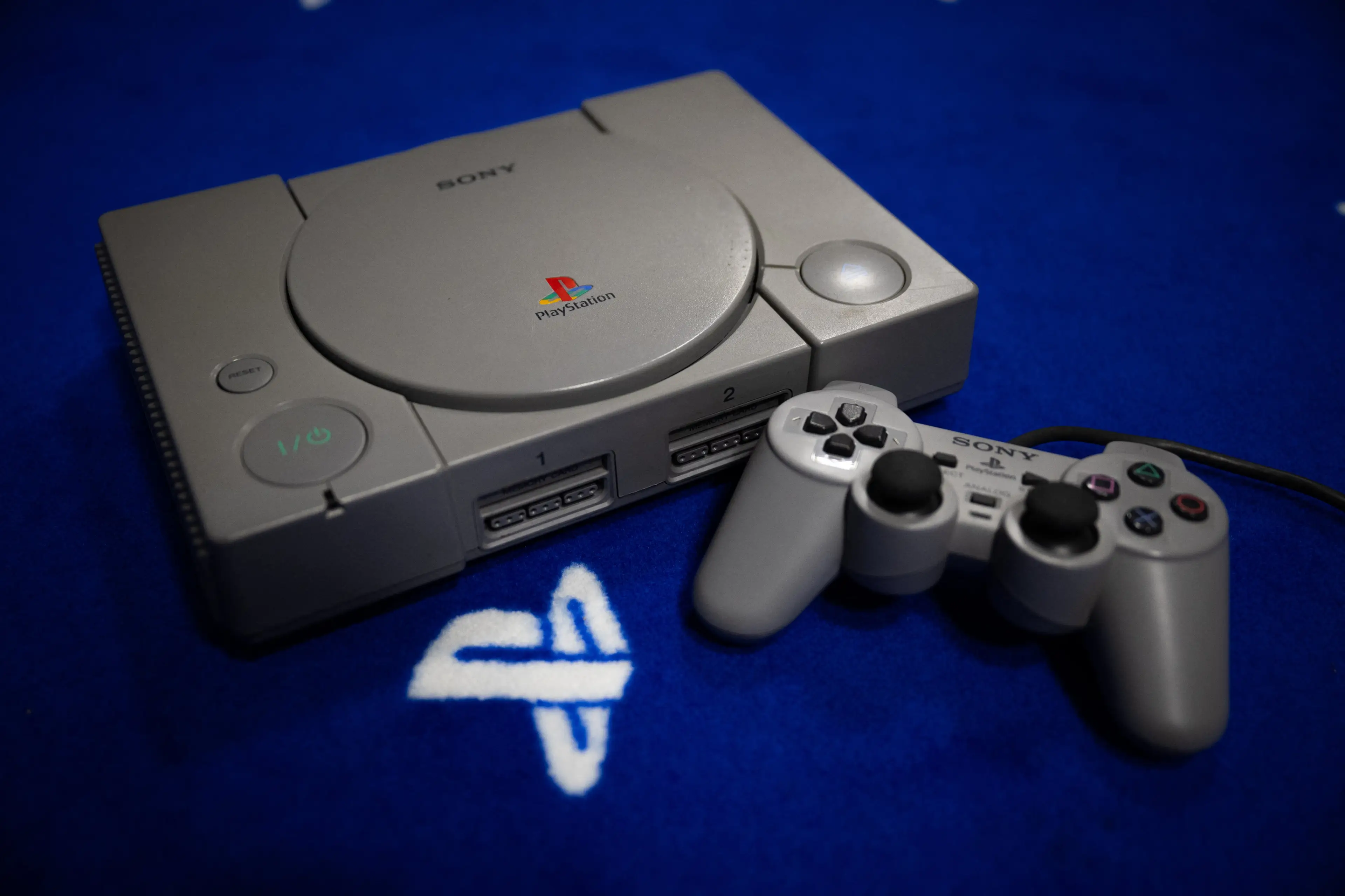
We've just passed the milestone moment of PlayStation's 30th anniversary, with December 3 marking three whole decades since the OG PlayStation was first released.
Advert
Although the PlayStation launched with Tekken and a handful of other games, it really came into its own with the release of classics like Tomb Raider and Crash Bandicoot.
Despite all those years of bashing buttons, you might not have thought about what the iconic quartet of triangle, circle, cross, and square mean.
Get ready to have your mind blown, because in a resurfaced interview, their origins have been revealed.

According to a 2010 interview with Famitsu magazine (via Eurogamer), PlayStation hardware designer Teiyu Goto explained: "Other game companies at the time assigned alphabet letters or colors to the buttons."
"We wanted something simple to remember, which is why we went with icons or symbols, and I came up with the triangle-circle-X-square combination immediately afterward. I gave each symbol a meaning and a color."
As for what each one means, Goto continued: "The triangle refers to viewpoint; I had it represent one's head or direction and made it green. Square refers to a piece of paper; I had it represent menus or documents and made it pink. The circle and X represent 'yes' or 'no' decision-making and I made them red and blue respectively."
When you look at the buttons, having a triangle for movement, square for menus, circle for a yes action, and a cross for a no action makes perfect sense.
We won't pretend to understand the colors, and according to Goto, lots of others don't: "People thought those colors were mixed up, and I had to reinforce to management that that's what I wanted.
"Getting to use such simple symbols in a design is an extremely rare opportunity, and it was really a stroke of luck to me."
All these years later, the combo of symbols and colors has become synonymous with the brand and the wider gaming industry. Goto concluded: "When you think of the Madonna in painting, most people come up with the same image of the same woman in their minds.
"In a similar way, the combination of those simple symbols has come to represent both the PlayStation and the fun of videogames, and being able to communicate that is a great thing." The buttons are so iconic, they've even been etched onto the PS5 controller.
We've come a long way since the PlayStation's launch, and leaving Lara Croft's triangular breasts way in the past, the likes of Final Fantasy 7 Rebirth, The Last of Us Part II, and Marvel's Spider-Man are visually stunning PlayStation exclusives that have us picking Sony over Microsoft.