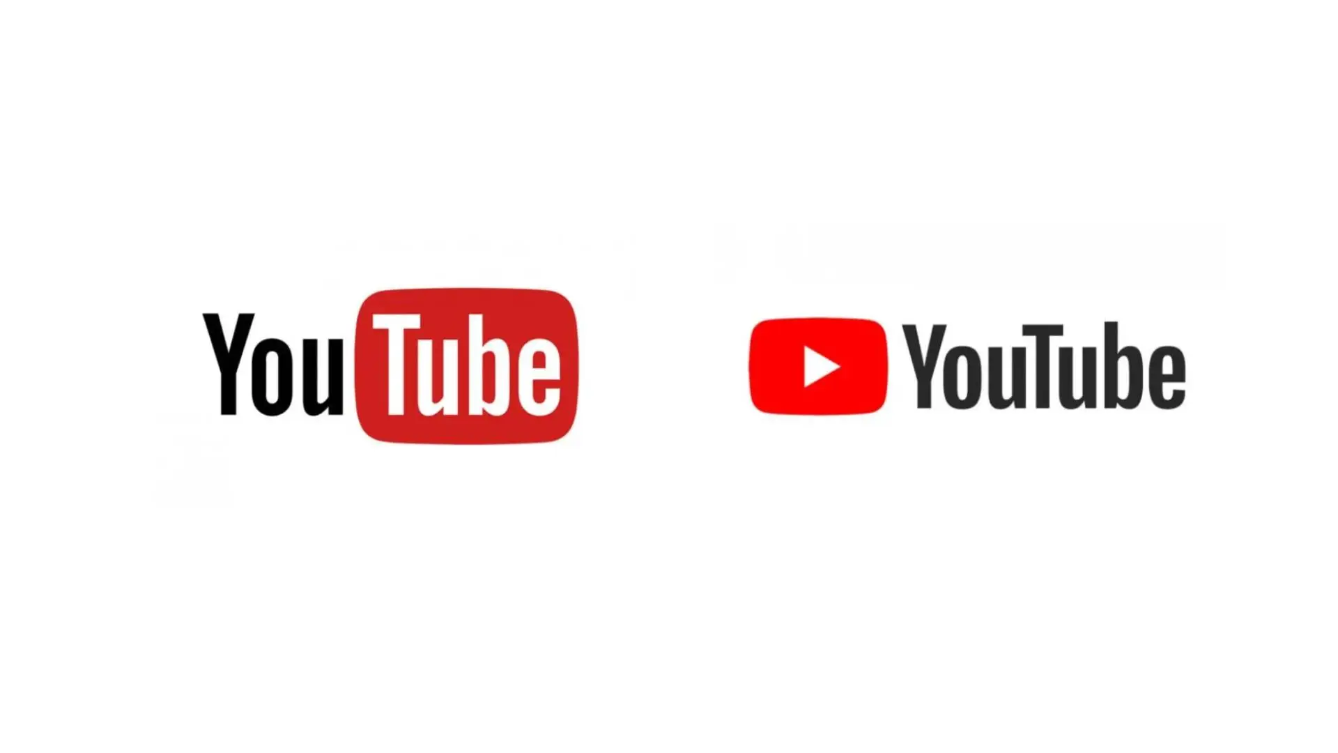


YouTube have made a small but mighty change to their logo after seven years.
Change can be scary sometimes, and when it comes things we use every day, it can be terrifying. Apple might only deliver subtle changes to its iPhones, but every year, it seems there's some newfangled feature we have to get used to.
You'll finally get used to Netflix's new interface, and then suddenly, it becomes a confusing mess where all your favorite shows have been shifted around.
YouTube has been our constant, taking us through the years with a manageable user interface and plenty of easy features. It was like coming home to a huge from an old friend.
Advert
Emphasis on the was part of that.
For the first time in seven years, YouTube has changed its logo. Safe to say, you aren't happy.

If you boot up YouTube, it might look like business as usual with your favorite mukbang videos and Lady Gaga's new single there to be enjoyed. However, eagle-eyed 'Tubers' have noticed that YouTube has changed its logo.
You might remember when we wrote about the subtle change to the playback bar adding a pinkish hue to your clips. YouTube was clearly a fan of that color, because now, the logo has been given a bit of pink blush.
Things have kicked off on Reddit, with fans not sure why the video giant would make such a minute change instead of going for a whole redesign.
After seven years of the bright-red logo, YouTube could probably do with a bit of a refresh, but why not go the whole hog? Before it was swallowed to make way for X, Twitter was known for regularly changing its logo.
Someone in the the comments claimed to have a degree in advertising and suggested that this new red could be seen as 'friendlier' and as a way to distance YouTube from the similar red color it shares with Netflix.
YouTube's xFE0000 is 'pure red', and as there have been plenty of different shades in the past, most are unable to see what all the fuss is about. Still, it's clear you aren't happy.
One disgruntled fan said: "Pure red is my favorite color. I find the new one uglier, disproportionately so when you think about how small of a change it really is. I'm the same way with reds that lean slightly towards pink or orange."
Another raged: "I'm moderately colorblind and it makes the UI more difficult."
Not everyone hated it, as someone else chimed in: "Pure red hurts to look at, the pinkish red is a lot more easier on the eyes, so i appreciate the color change, although I'm not too sure why they couldn't have chosen a darker shade."
We'd understand if there was outrage after YouTube changed its logo to some sort of abstract monstrosity where you can't tell it's YouTube, but at the end of the day, this is just a slight color change to most. Unless you're colorblind and it's genuinely affecting your UI, we're sure there are bigger problems going on in the world right now.