iPhone users left divided over dark mode vs light mode debate
There are two tribes out there, even if you didn't realise it.

Ever since it first started to spread through apps and operating systems a few years ago, dark mode has become a bit of a theology for some people.
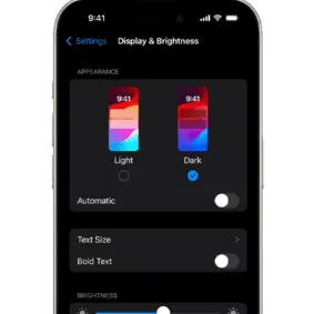
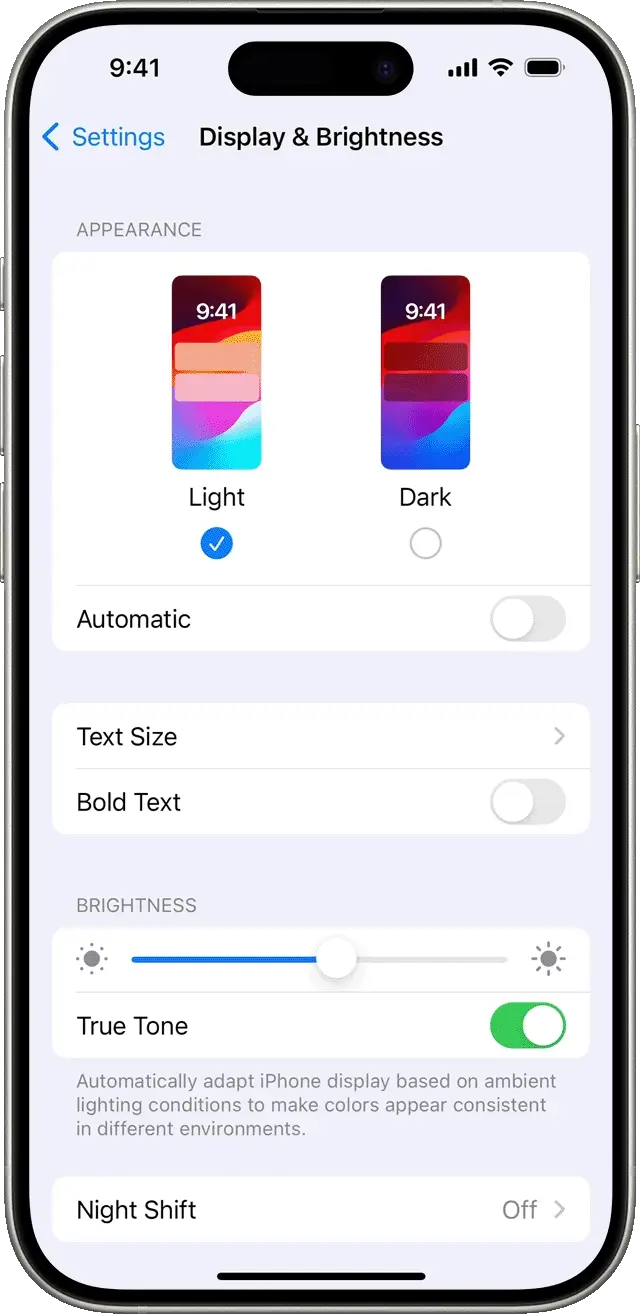
While many of us might leave our iPhone on default settings and let it adjust between lighter and darker modes depending on our bedtime settings and the time of day, there are many people out there who religiously believe that one is more aesthetically pleasing.
Whether they like lighter tones, white backgrounds and black text, or prefer muted inky blacks with white text seems to come down to personal preference.

Advert
The gulf between these two choices has been thrown into stark relief this week by a viral Reddit post on the iPhone subreddit, asking people which they prefer.
The author of the post stated mildly: "I am more comfortable in light mode. I do a lot of reading on my phone or laptop. When those are dark, my reading speed decreases in comparison to the light ones".
That thought was pretty much instantly rebutted by the top comment on the post, though, which actually has twice as many upvotes as the post itself at the time of writing, underlining its popularity.
That comment said: "Dark mode 24/7 lol I can’t stand Light mode idk why", and garnered plenty of assenting responses.
One person replied: "Light mode gets too bright for me sometimes", while another person said: "Same. I hate apps and sites that don’t support it. It’s so blinding."
So, it's clear that being able to browse comfortably at night and in low light is a huge motivating factor for those who love dark mode.
Another argument in favour of dark mode came in a different comment, which pointed out: "Dark mode and anything completely black can actually help a bit with battery life given these are OLED screens. Probably not massive amounts but it is there".
This is accurate, too - if you have an iPhone from the last couple of years, and particularly an iPhone Pro model with a slightly fancier display, this can indeed help you to maximise your battery life.
As the comment suggests, the margin here might be absolutely tiny, but it's enough to be just about noticeable over time.

Very few people in the comments are coming to bat for light mode, in fact, with one of the few people arguing in its favour saying: "I use light because the white in light mode is the same in every app, compared to the black and various shades of gray in dark mode."
Still, though, for all the polite division there is a middle way as we mentioned above - and one comment sums it up: "Maybe I'm a bit strange but I'm using auto mode: light from sunrise to sunset and dark from sunset to sunrise".
This might just give you the best of both worlds, with a bright and readable display in daylight changing to a muted and easy-on-the-eye look at night.