Following the release of iOS 18, there's been major hype among fans to get their hands on Apple's upgraded AI systems and brand-new features.
But as the software has just rolled out for public beta access, two settings have been meet with some backlash from iPhone users.
Luckily, there's a way to fix them:
Advert
How to clean up the Photos app in iOS 18
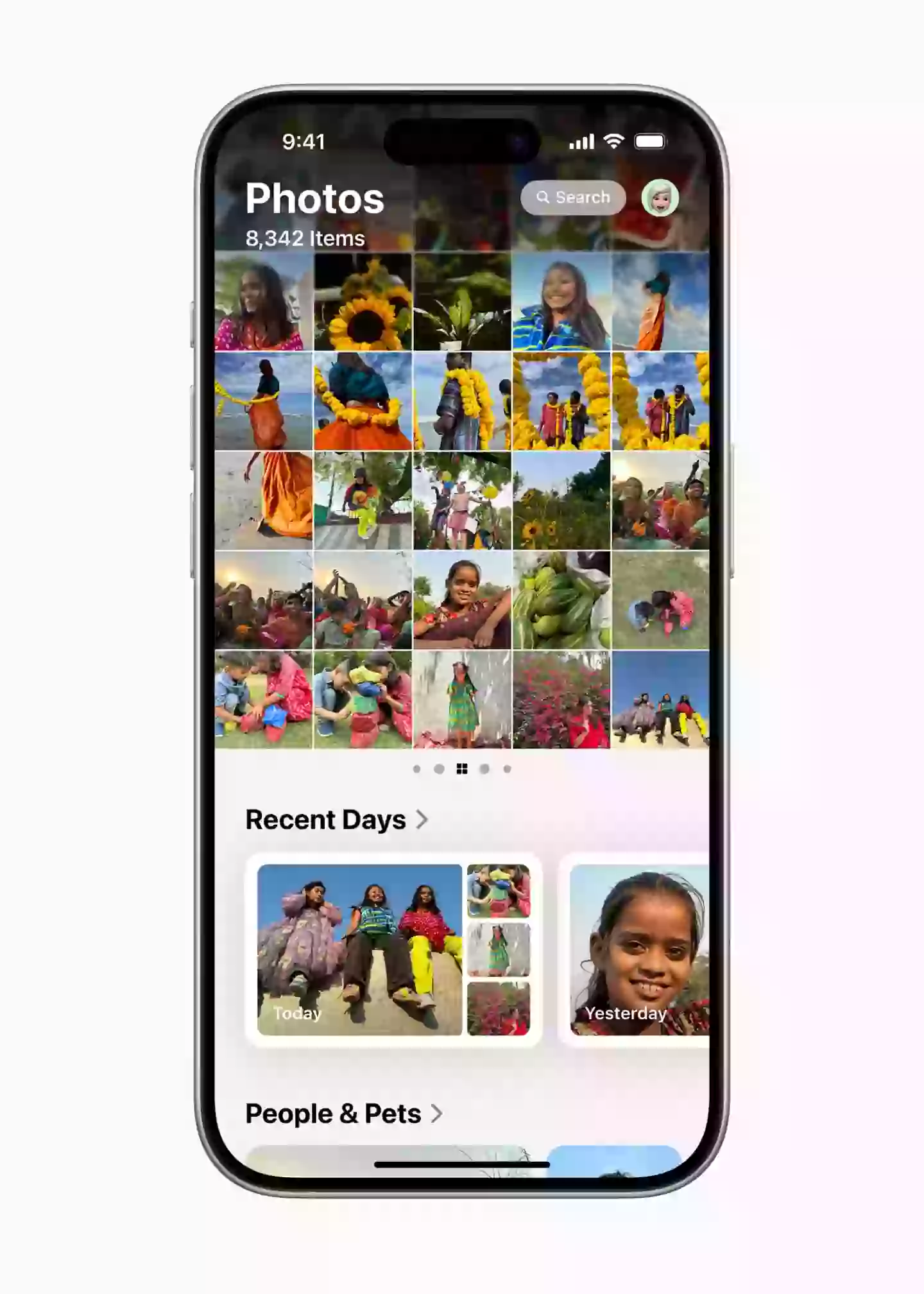
iOS 18 brings a major redesign to the Photos app, with Apple claiming it its 'biggest-ever design update'.
When you open it, you'll see a grid of all your photos and videos. But you might also notice that the navigation bar at the bottom has been replaced with a 'collections' menu that lets you browse recent photos and those of friends, family, or pets.

Advert
Although Apple may have had good intentions to simplify all photo options onto a single screen, it has not sat well with the majority of users.
On X (formerly Twitter), one commenter wrote: 'The new Photo App in iOS 18 is one of the worst designs Apple has ever released. I can't believe it survived multiple betas. I hate it so much.'
Luckily, there is a way to fix this clutter:
- Swipe down to the bottom of the Photos app and tap "Customize and Reorder."
- Here, you can uncheck any collections you don't want to see on the main screen.
- You can also arrange the order of these collections to suit your preference.
Advert
How to simplify the Control Center in iOS 18
Most users use the Control Center to connect to Wi-Fi, enable DND mode or flick between dark and light mode.
However, following the iOS 18 update, in the control centre, users have been provided with many more customisation options, even with controls from third-party apps.
Advert
The most aggravating of such is that you can now spread your widgets across multiple pages rather than one single, organised page which is resulting in some glitchy behaviour.
Advert
Some users called it a 'convoluted mess' whilst one X user called it the 'buggiest sh**' they've ever used as they shared a recording of them attempting to move the icons around.
Fortunately, there's an easy way to get the Control Center to look like it used to:
- Swipe down from the top-right of your screen to open the Control Center.
- Swipe up to access additional pages of controls.
- Press and hold on to any empty space on the page until the controls jiggle.
- Tap the (-) button at the top-left of any page to remove it.
Do this for any other extra Control Center pages you have, until you are left with just the main page.